Cox Brand Style Guide
Role
Client
Agency
FCB
Cox
Creative Director
In 2018, Cox went through a complete redesign of its core brand. As part of the rebranded experience, Cox tasked FCB with creating a redesigned scalable design system that could be used to revamp the look and feel of pages across all of Cox’s core product.
Original Brand Style Guide Overview
Originally created in Sketch, the Style Guide was created with two primary goals in mind. The first was to create visual and experience consistency across all .com deliverables. The other was to create a scalable system that could be used by internal Cox employees and external partners to create pages quickly and more efficiently.

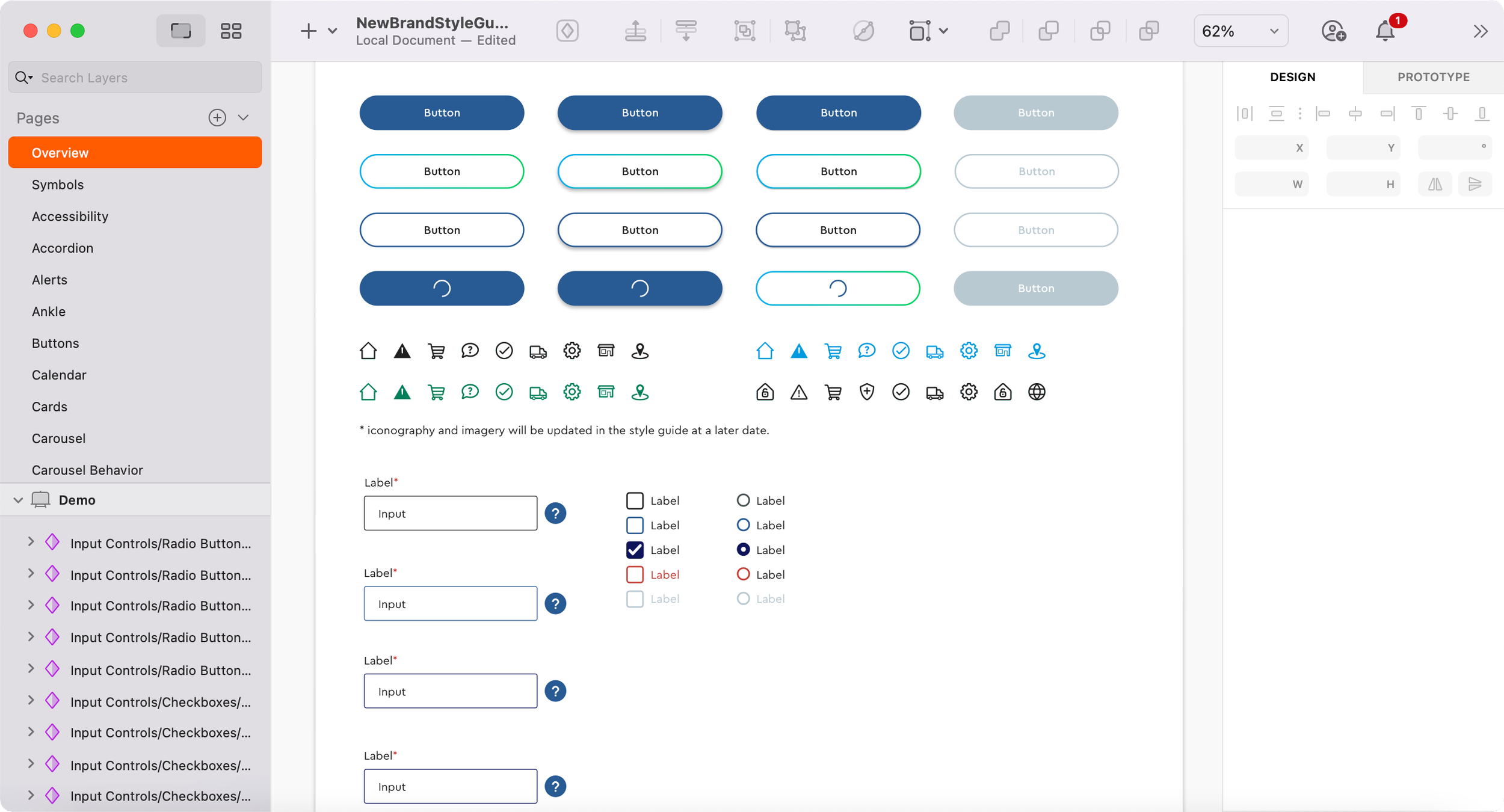
Button States
To solve the goal of consistency, the FCB team wrote extensive documentation for all component categories. This involved detailing the usage as well as the visual look and feel.
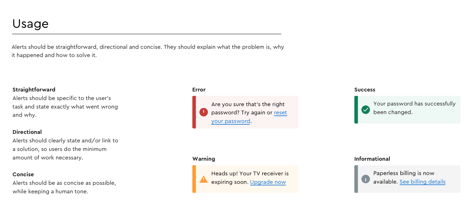
Usage Documentation Snippet

Spacing Documentation Snippet
To solve the goal of scalability, the team created a system of “content pods” or pre-fabricated pieces that can be used by designers (or non-designers) to build pages within the .com experience. The final system of content pods consisted of hundreds of pieces that could be used to build out pages quickly and consistently.
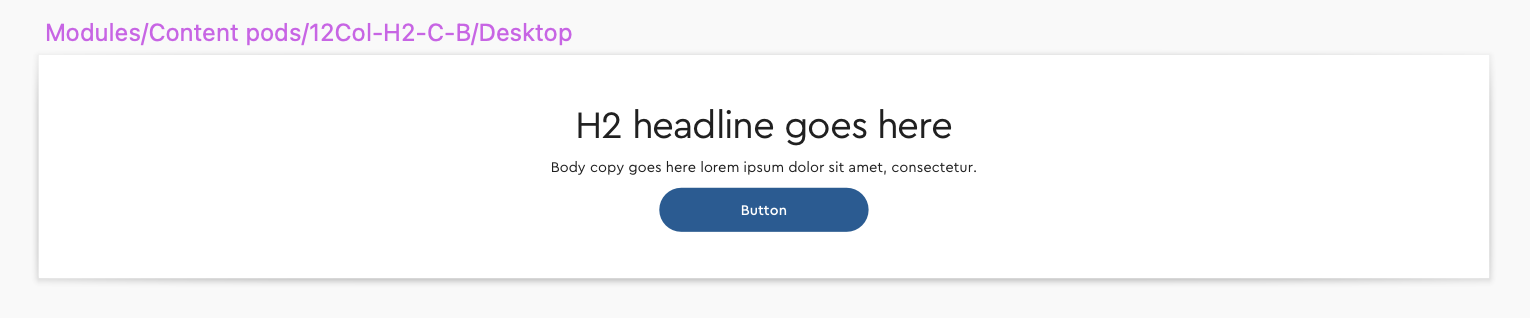
12Col-H2-C-B Content Pod

6Col-H2-C-LT Content Pod
While the team developed the Style Guide, WAG 2.1 accessibility standards were also taken into account to ensure that the Style Guide could be used by all.

Accessibility Documentation
As part of the original execution of the design system in 2019, the team used the new components to redesign 104 pages in the Cox .com experience to match the new brand.

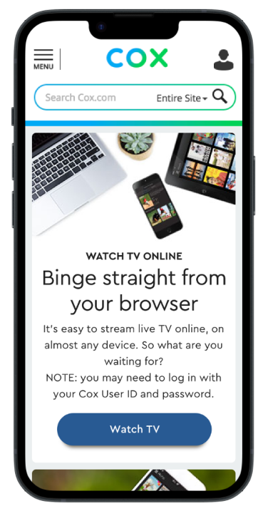
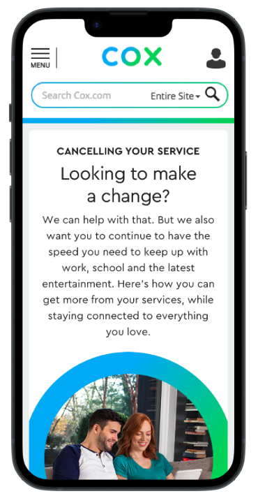

Brand Rollout Pages
The design system continues to evolve and grow to meet the needs of Cox’s products. Although the system was originally created as part of the new brand redesign, it has now become the standard for all digital products across Cox’s ecosystem.